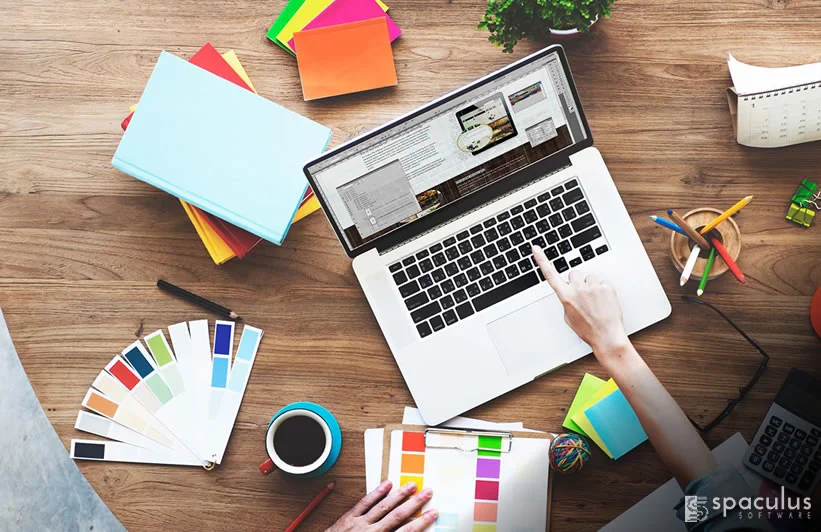
Top 4 Web Design Principles To Improve Conversion Rate
A few years back, driving traffic to your website used to be important along with other components of marketing such as SEO, social media marketing and guest blogging. What was most forgotten in led generation strategy was implementing the idea of excellent and aesthetically pleasing website design. The influence of putting a great face of website design visibly impacts conversion rates.
A research says that almost 46% of people believe the brand credibility based on their web design. A study by Adobe confirms that two third of website visitors would rather prefer a beautiful design while reading the content.
This goes to emphasize the potential of having a professional, engaging and stunning website design. Below are 4 critical web design principles to elevate conversation rate.
1. Never compromise on loading speed
Today’s internet-addicted generation has limited patience and zero tolerance for websites that load really slow. They want everything to be fast, efficient and elegant. A study reveals that even a second of delay in page load time will cost you nearly 7% loss in conversion.
Hence, your site should be snazzy, responsive and light enough to load quickly. Add contents in compressed yet readable form because every second matters. To ensure your website has optimal page load speed, you can test it using tools such as:
2. Understand and adopt Hick’s law
Some of you might not be completely aware of Hick’s law. It suggests how action results are subject to the presented choices. In terms of website design, the principle of Hick’s law can be applied by reducing the number of choices users have on your site. You can:
- Minimize the volume of navigation links since users are likely to feel drained and lose interest.
- Opt for a full-screen welcome gate right on your homepage that contains a single call-to-action button and enables users to explore one choice at a time until they want to buy more.
- Lower the number of distractions on your homepage without affecting other user-important actions and functionality.
3. Use Negative Space
Negative space in web design is the empty whitespace that is free from chief content elements on your website. The negative space, however, can be a key to bringing positive results as it enhances readability, cleanliness and user-friendliness. Manipulating and optimizing negative space can grab more attention from users, increasing opportunity to boost conversions.
To effectively use whitespace, you can:
- Keep your fonts either small or moderate
- Maintain the line height up to 150% of the font size for ideal readability
- Try to keep smaller paragraphs to enlarge white space
- Use better margins for header, footer and sidebar
4. High quality images
Images are a big influencer as research from Skyword concludes that content with suitable images can help receive 94% more views. Also a marketing survey by Bright Local unearths that 60% of people gravitate to search results with images and 23% are interested in contacting businesses displaying images. With that said, find HQ photos that connect with the audience.
Some of the famous online portals to get free stock of evocative images:
Conclusion:
Apart from these tips, you should never forget the importance of colours that can evoke special emotions your brand intends. Also clutter-free simplicity of design impacts conversion. You can implement these web design principles next time you want to create a compelling website.