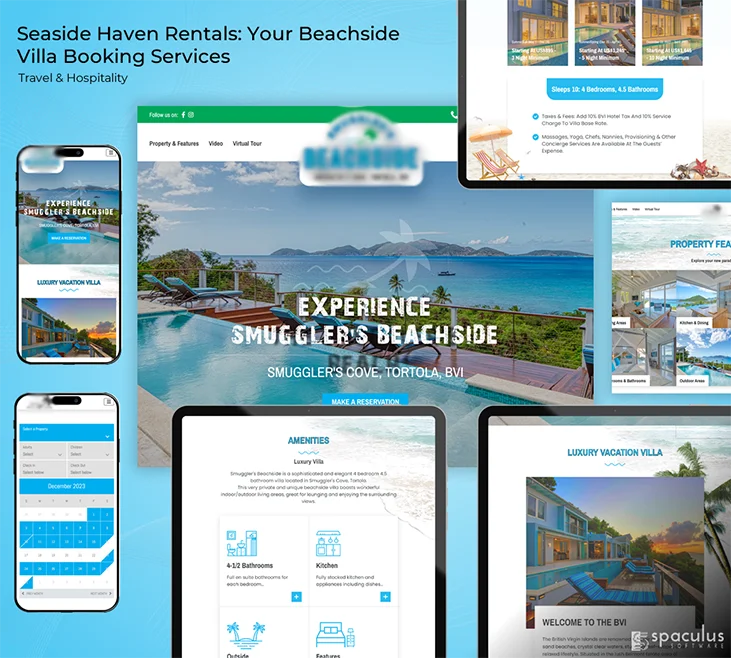
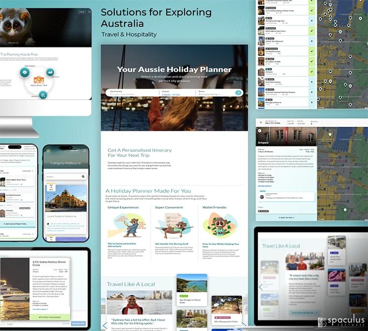
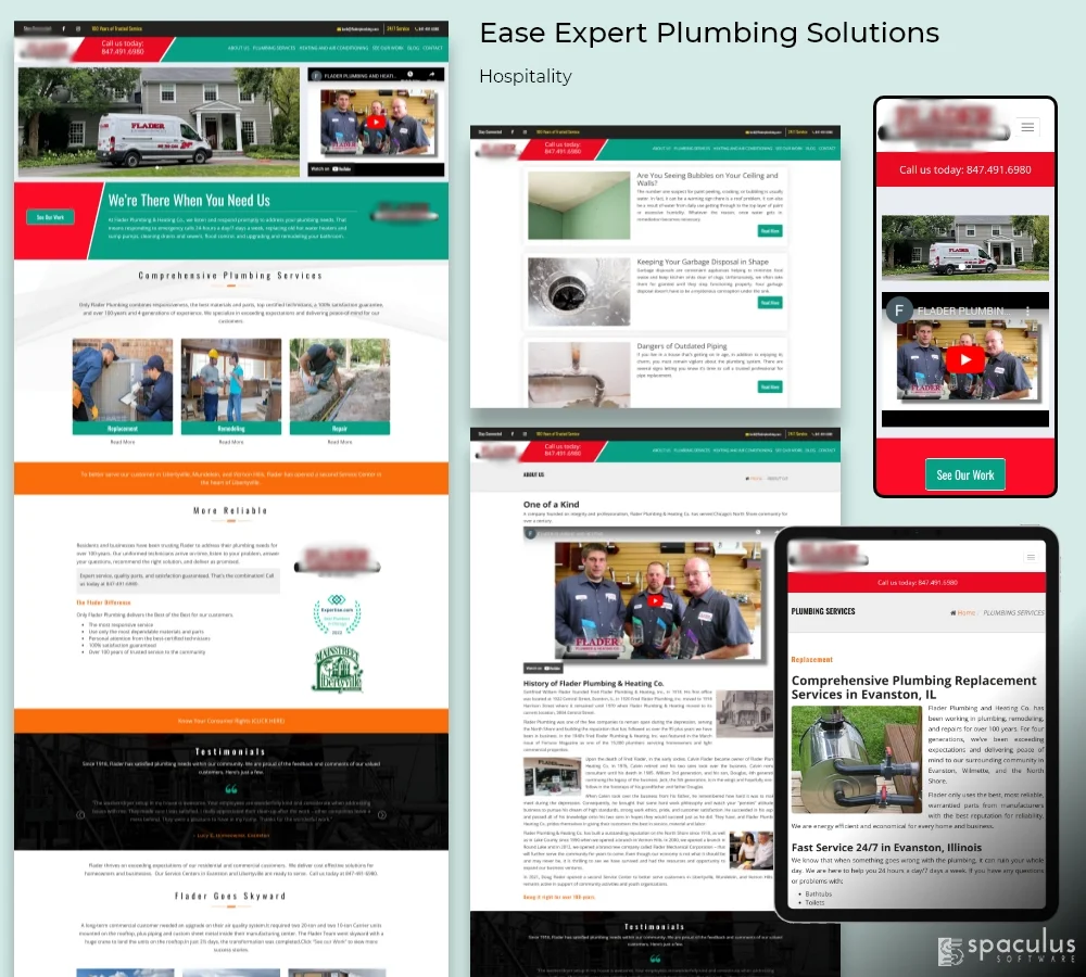
Responsive web design is one of our core strengths. We don’t just adapt your website to different screen sizes, we strive to create a seamless, user-centric experience that works across all devices. Our approach is focused on putting the user first, which means we pay close attention to navigation, layout, and aesthetics to ensure your visitors have an engaging journey. Our designs are informative, innovative, and captivating, and they leave a lasting impression. By ensuring consistency and engagement, we help your brand make an impact online. With our responsive web design solutions, you’ll experience a perfect blend of artistry and innovation. Our designs capture attention, cut through the digital noise, and help your brand shine.
Key Highlights:
- Holistic approach for a user-centric experience.
- Meticulous craftsmanship of intuitive navigation.
- Aesthetic layouts that capture attention.
- A steadfast focus on innovative aesthetics.
- A commitment to both consistency and engagement.
- A platform for your brand to radiate online.
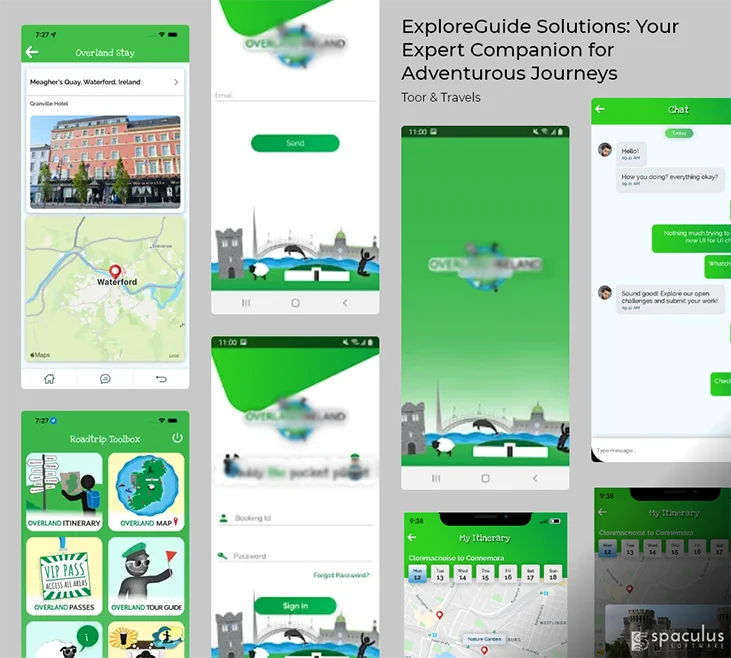
Our team boasts a wealth of experience in mobile app design, encompassing a wide range of platforms, including iOS and Android. We are committed to ensuring that your digital presence resonates with a diverse and constantly evolving audience, providing accessibility and an immersive experience across the board. No matter your industry, be it e-commerce, social networking, or any other specialized field, our mobile app designs are more than just visually appealing – they are an intricate blend of informative content, innovative features, and captivating engagement that leaves a lasting impression on your users.
Comprehensive Features:
- Cross-platform proficiency that embraces both iOS and Android.
- Tailored designs meticulously crafted to suit diverse industries and niches.
- Interfaces that are not merely visually arresting but also deeply immersive.
- A steadfast dedication to innovation and aesthetic finesse.
- Intuitive interfaces that keep users both hooked and delighted.
- Designs that harmoniously balance informativeness and innovation.
Are you noticing that your website or mobile app is starting to look outdated and isn’t performing as well as it used to? It might be time for a change. Our redesign services will provide a complete transformation to your digital presence, enhancing both the User Interface (UI) and User Experience (UX) to meet the latest trends and surpass user expectations. With our assistance, your digital platform will be given a new lease on life, making it more appealing and intuitive to your audience.
Our Comprehensive Approach:
- In-depth Assessment
- Revamped Aesthetics
- User-Centric Focus
- Modern Trend Integration
- Performance Enhancement
As a product prototyping company, we pride ourselves on our ability to bring your product ideas to life in stunning detail. Our team of experts specializes in crafting interactive prototypes that serve as a dynamic canvas for you to not just visualize but meticulously test your product concept before committing substantial resources to development.
We understand that the process of creating a new product is an iterative and transformative one, which is why we work tirelessly to ensure that every prototype we create is not just functional, but meticulously user-centered and truly delightful. Our goal is to help you refine your ideas and create a product that not only meets your needs but exceeds your expectations.
The Comprehensive Journey of Product Prototyping:
- Concept Visualization
- Interactive Prototypes
- Realistic Testing
- Iterative Refinement
- Functional Assurance
- Cost-Effective Innovation


